Template for the New Twitter Layout
I’ve been able to play around with the new Twitter layout since March the 22nd, when I created a new account for a friend.
Since then I’ve been taking screen shots, measuring things and looking for any changes to the layout before publishing this new Twitter template. I wanted to see if the changes I was seeing were final or if the Twitter elves were still refining things…
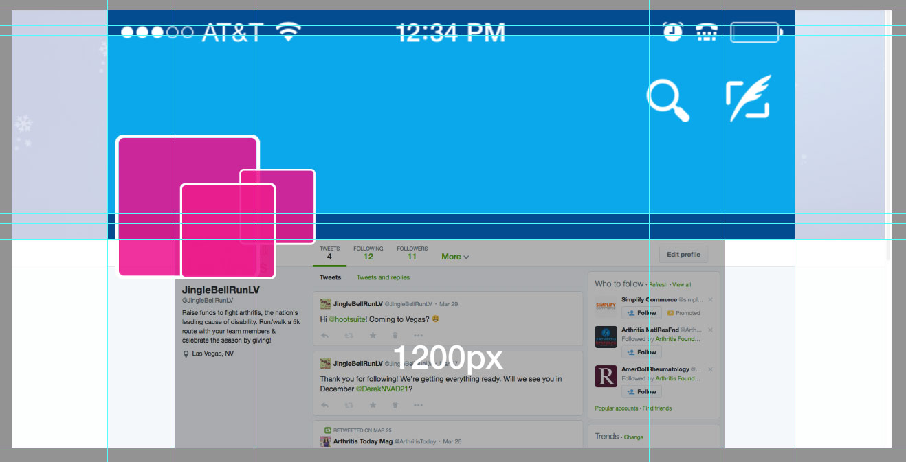
Twitter Header Photo Dimensions are 1500×500
 Even if your screen is 1920×1080! It wouldn’t be so bad if things scaled correctly but that’s not what happens… On the desktop, it doesn’t seem to matter what size your screen is, some part of your image will be cropped. Mobile has changed and we no longer have our profile image and bio covering our header photos. Twitter now looks more like Facebook on mobile.
My recommended buffer or “safe” zone is 55px at the top and bottom of the graphic. Keep important stuff like logos, phone numbers or website urls away from the edges.
One nice thing about the new layout is that the profile photo is now much larger, it is displayed at 200x200px compared to 73x73px on the “old” layout. Twitter does recommend that profile photos are 400×400 though, never know when someone might click on your photo for a close-up.
The Transition will be painful
It will be nice when the mobile apps are updated to match the new desktop layouts.
The Mobile App Now Looks The Same as the Desktop

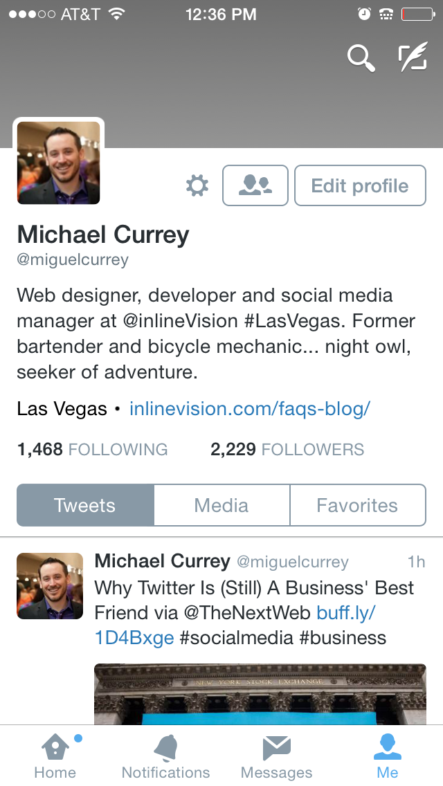 This is great news, cover photos don’t get cropped on mobile devices!
Just look at how our cover photos were covered up, cropped and shaded before… this is much better.
Now, my only issue is that my phone’s info (signal strength, wifi indicator, time, battery, etc.) is now covering the top of my cover photo. Why can’t those items live in their own space? This doesn’t happen in the Facebook or Google+ app. Twitter also throws a couple of larger icons/button in there on the right side. Not as annoying as before but still kinda bugs me. Why is the Edit Profile button button so large? Can’t it go under the gear icon/menu to make room below the cover photo? Do we edit our profiles more than we Tweet?
So many questions… ;)
What About the Twitter Background?
 Although the new Twitter design seems to discard the backgrounds we’re all used to, it’s not so…
There is one instance (so far) where your Twitter background will be displayed. When someone is viewing a single tweet by itself.
H/T Hugh Briss @ Social Idendities.
The width of the tweet box is 640px wide. I am including a template for the background with my usual guides for screen widths in the download.
This is a golden opportunity to use the background to add additional information or branding and calls to action. Since someone will probably only ever see a single post unless you send them a link to it, you can probably feel safe using the Twitter background for specific campaigns… as always, you’re only limited by your imagination.
Hope you like the templates.
As always, leave your feedback in the comments.
About the author:
Michael Currey is an experienced web designer, front-end developer and social media manager with 15 years of experience and an education from the Academy of Art University in San Francisco.
13 Responses to “Template for the New Twitter Layout”
Leave a Comment
3 Trackbacks
- New Twitter design – a tour & to-dos for your small business * Small Business Bliss
[…] My friends at inlineVision have a free template you can use for the new design – access it here. […]
- Dica: dimenões do novo layout do Twitter | Blog da PaperCliQ
[…] + Conteúdo {lang: 'pt-BR'}Quer customizar seu Twitter e não lembra quais são as dimensões do novo layout? Segue, abaixo, uma dica rápida com os tamanhos exatos e, também, um template para auxiliar sua criação. Mais informações no blog Inlinevision […]
- The Most Recent Twitter Update: Your Thoughts? | Colleen Eakins Design | Atlanta Freelance Graphic Designer
[…] Photoshop & PNG Template Files by Inline Vision (requires email list sign-up) […]
Search
-
Latest Articles
-
 Jul 17, 2021
Woocommerce Security Woos
-
 Apr 15, 2020
Citibank and Other Bank Scam Text Messages
-
 Mar 6, 2020
Hostgator Account Phishing Emails
-
More From Our Blog


Seems to me that the big three are all going for the same look!
saying that though i must admit the profiles do look much better now!
thanks for sharing the psd MC I will deffo be using it myself
All the best!
– PD
It does look a lot like Facebook. The think I like about Facebook though, is that the cover photo stays the same size no matter how wide your screen is. Makes it easy to do those cool “seamless” designs.
Wonder how long this new design will last before it gets updated? :)
I think you mean Twitter, Michael (in response to Phillips comment). Facebook still resized the cover photo a bit and fades the bottom half quite a bit. I love how Twitter’s cover photo stays the same size. Makes life much easier for social media managers! If only the others would follow on this trend.
Thanks. I agree that it does look quite a bit like Facebook. I’m also curious to see how long it will last. One of the most frustrating things for me with social media is the changes (almost constant if you are on or manage accounts on multiple platforms) made to layout/image specs. But, I suppose, change is good!
Awesome! Thank you.
Perfect! Thank you.
THANKS!
How do you rectify the fact that no matter how high a res or size you put in all artwork is fuzzy and ugly. We prided ourselves on our artwork and now it just sucks. HELP!!
There’s nothing you can really do. Twitter resizes larger images down to 1500x500px.
It’ does disappoint though. Maybe they’re getting low on disk space?
awesome!!! thanks
Hi Michael.
I’m a bit confused by all of this and have been running some tests of my own.
I can’t fathom the 1500x500px issue. On my 1920×1080 screen it is certainly not a fixed width at 1500 and stretches to the full width of the screen.
Also, the 500px height adjusts depending on the size of the browser window.
That said, I’ve only been working on the “Take a Look” preview – I don’t know if that makes a difference. I’m not ready to update just yet until I’ve got these measurements nailed.
They have changed the functionality of the layout since I posted this article.
Before, the header photo are did not get taller when the screen got wider. It stayed constant at 500px.
Today I’m seeing something different. The header area does get taller, the wider the screen is, but it doesn’t maintain the 3:1 ratio of the 1500x500px image perfectly.
The image I’m testing is still being cropped. The buffer area in my template is still a good guide.
[…] My friends at inlineVision have a free template you can use for the new design – access it here. […]
[…] + Conteúdo {lang: 'pt-BR'}Quer customizar seu Twitter e não lembra quais são as dimensões do novo layout? Segue, abaixo, uma dica rápida com os tamanhos exatos e, também, um template para auxiliar sua criação. Mais informações no blog Inlinevision […]
[…] Photoshop & PNG Template Files by Inline Vision (requires email list sign-up) […]
wonderful