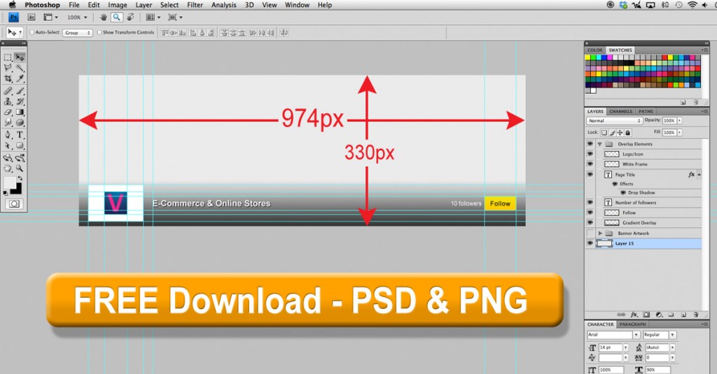
LinkedIn covers up parts of the banner on it’s Showcase Pages… just like Facebook and Twitter. I first read about them on Hubspot’s blog in November but haven’t seen a really good use for them. But like all things social, I decided to create one to see how it went.
Facebook has the profile photo over the left side, Twitter puts theirs in the middle and the bio covers a good portion as well. Not only that but Twitter thinks we all want a dark gradient added to our headers, like we couldn’t put one in if we thought it was needed. LinkedIn does the same. Logo on the left, page title, follow button and that darned gradient!
The dimensions for the Showcase Page banner are 974px by 330px.
Tip: I would be sure to upload the square 50×50 pixel logo/icon with a white background. As you can see there is a large white box surrounding it. I like the way our V icon looks in the second example much better.

