I’ve been able to play around with the new Twitter layout since March the 22nd, when I created a new account for a friend.
Since then I’ve been taking screen shots, measuring things and looking for any changes to the layout before publishing this new Twitter template. I wanted to see if the changes I was seeing were final or if the Twitter elves were still refining things…
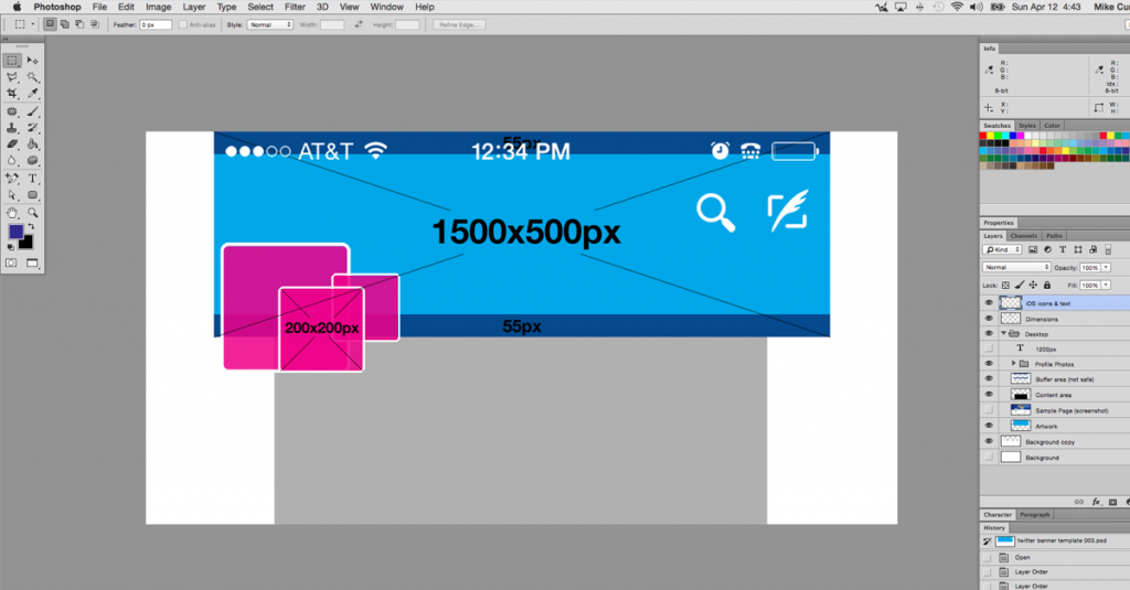
Twitter Header Photo Dimensions are 1500×500
My recommended buffer or “safe” zone is 55px at the top and bottom of the graphic. Keep important stuff like logos, phone numbers or website urls away from the edges.
One nice thing about the new layout is that the profile photo is now much larger, it is displayed at 200x200px compared to 73x73px on the “old” layout. Twitter does recommend that profile photos are 400×400 though, never know when someone might click on your photo for a close-up.
The Transition will be painful
It will be nice when the mobile apps are updated to match the new desktop layouts.
The Mobile App Now Looks The Same as the Desktop
Just look at how our cover photos were covered up, cropped and shaded before… this is much better.
Now, my only issue is that my phone’s info (signal strength, wifi indicator, time, battery, etc.) is now covering the top of my cover photo. Why can’t those items live in their own space? This doesn’t happen in the Facebook or Google+ app. Twitter also throws a couple of larger icons/button in there on the right side. Not as annoying as before but still kinda bugs me. Why is the Edit Profile button button so large? Can’t it go under the gear icon/menu to make room below the cover photo? Do we edit our profiles more than we Tweet?
So many questions… ;)
What About the Twitter Background?
There is one instance (so far) where your Twitter background will be displayed. When someone is viewing a single tweet by itself.
H/T Hugh Briss @ Social Idendities.
The width of the tweet box is 640px wide. I am including a template for the background with my usual guides for screen widths in the download.
This is a golden opportunity to use the background to add additional information or branding and calls to action. Since someone will probably only ever see a single post unless you send them a link to it, you can probably feel safe using the Twitter background for specific campaigns… as always, you’re only limited by your imagination.
Hope you like the templates.
As always, leave your feedback in the comments.

