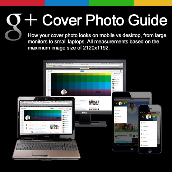
The new Google+ cover photo is quite large — which can be a good thing… The problem I have been struggling with is the fact that part of the image is hidden – depending on which device you are using and even the size of your screen (desktop).
Cover Photo Size
The maximum or recommended size for the cover photo (according to Google) is 2120px by 1192px. This is the same size they recommend for the new YouTube “One Channel” design as well. Although most of it will probably never be visible, since all but the center 350px is reserved for viewing on televisions. See my post on the new YouTube Channel Art for details and the downloadable Photoshop template.
Many Screens, Dimensions and Issues
On the desktop, depending on the size of your screen you will only see the bottom two-thirds or so of the image. You have to scroll up to see the entire image. Kinda weird, right?
On your phone, when using the G+ app, you can see the cover photo when accessing the menu, and you get another (different) view when you tap on your profile photo – taking you to your profile view. The problem here is that in the pull-out menu view most of your cover photo is covered up by your profile photo and a couple of icons. On your profile, only a small portion of the cover photo is displayed and it’s not even the full width: it’s just a small piece of the background pulled from the center right side of the cover photo.
Safe Area?
The best thing you can do is keep the most important or vital parts of your design centered in the middle part of the cover photo. The top is hidden and the bottom is covered by your profile photo and profile details.
Skip the Style Guide and download the Google+ cover photo template.
Note: We ask for your email so that we can notify you of updates to the template, just in case something changes or the information we have is incorrect. You will not be added to a mailing list.
Since Google+ is dead, the download is no longer available.

