Responsive Websites:
Design + Functionality = Better Usability
The mobile web is unstoppable, due to what I usually refer to as “The Three ‘A’s”: Affordability, Accessibility and Availability.
Thanks to the Smartphone Revolution (alright, Thank You Apple), almost everybody can access the internet on-the-go, cellphone and data providers have made it (somewhat) affordable and more and more businesses, communities, cities and airports make it further accessible by offering free Wi-Fi hotspots.
Mobile traffic is steadily on the rise; We see an average increase of 1% in mobile traffic every month on our clients’ websites. Reason enough for everybody to implement a mobile strategy.

Responsive, Not Mobile: Because Google Says So
At least since Google announced it publicly on their Webmaster Central Blog in April 2012 (Google Webmaster Central Blog: Responsive design – harnessing the power of media queries) it’s official: Not only do they support responsive design, they endorse and highly recommend it.
Meaning: Mobile Websites are officially finally dead, long live Responsive Websites.
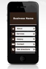 It’s no secret I’ve always hated “mobile websites”. Those ugly, half-a**ed, no-good add-ons certain “web designers” (including some providers) were up-selling inexperienced website customers on.
On top of their atrocious look, most of the time those poor imitations of usefulness are hosted on some other domain, diluting the site owner’s authority and skewing their traffic statistics.
(If you have one of those, you should really talk to us.)
Responsive Design: Enhancing Functionality
Responsive Design is not just about making a website display halfway nicely on a mobile device. Instead, it’s about providing an optimized experience: You have to prepare and display your site’s content in a way that serves the mobile user and allows him to locate and access important parts quickly and effortlessly.
Mobile Users: Don’t Make Them Work For It
All Smartphones have full browsers. Meaning they are perfectly capable of displaying a full-size website (960 pixels or more wide) on the screen.
How wonderful! That carefully crafted and complex design shows up just the way the designer intended it to be. Unfortunately users now need a magnifying glass to make out what’s really important: the content.
That micro-dot at the bottom? Could be a phone number.
Sure, users can “zoom in” and then scroll left and right and up and down to enlarge the visible portion(s) until the phone number becomes legible. They know how to do that. Now they only have to memorize the phone number so they can enter it into the phone’s dialer. Easy enough, right?
Mobile Usability: High Expectations
The same way I expect an email addresses to be clickable, I expect a phone number to be “clickable” on a mobile device. I also expect a street address to take me to (google) maps. I expect a site’s navigation to actually work. I know, I am spoiled.
While display and functionality issues are extremely frustrating for a “normal” user; on many occasions I, a developer, am simply stumped by website owners’ lack of consideration for their audiences.
Especially since modern HTML and CSS allow website developers to tailor and style their creations like never before to provide excellent user experiences.
Responsive Functionality Tip #1: Tap to Call
If you want or expect people to call you (or your business) – maybe to inquire about your services, to request an estimate or to schedule an appointment – make it easy for them! In the responsive versions of the websites featured below, the phone number at the top is “clickable” and takes a user to the device’s dialer when “tapped”.
Do not use the “Tap-to-Call” implementation on the desktop version of your website: Most desktop browsers do not understand the “tel:” protocol and will display a “Protocol not supported” error.
Make the phone number (or the button) big enough so users can actually reach it with their finger.
Responsive Functionality Tip #2: Mobile Menu
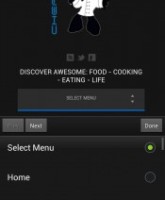
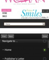
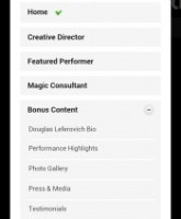
How does your website’s navigation behave on a mobile device? Remember, there is no “hover” state on smartphones or tablets – so in most cases the drop-down options become completely inaccessible.
Give users a mobile version of your navigation menu and don’t exclude them from accessing other pages on your website.
With only a few lines of HTML, CSS and jQuery you can implement a mobile menu your audience will truly appreciate.
Responsive Functionality Tip #3: Load More
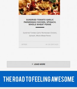 Infinite scrolling (also known as Twitter or facebook-like loading) to see more items (articles, images, etc) is a very considerate way to let the user decide if he is interested in seeing more of your content.
By putting the user in control of how much of your latest, featured or other content he wants to see, you don’t only create a great and (in my opinion) visually appealing effect users have become accustomed to through Social Media Mobile Apps, but you also show consideration for your visitor’s patience and potential bandwidth limitations.
Nobody wants to stare at an otherwise empty “Loading…” screen without any idea of how much more “Loading…” there is to do.
Responsive Functionality Tip #4: Tap To Map
My newest favorite – tap on an address and you get taken to the device’s map app.
We used microformats to implement this option in the responsive version of Smile Designers of Las Vegas.
While it works perfectly fine on Android, iPhone’s mobile version of Safari (so far) unfortunately refuses to recognize the address – at least without any negative consequences for the user.
Do you need help with an assessment of your current website or with the development of a responsive version of your website? We can help! Simply click the button below to start the conversation.


